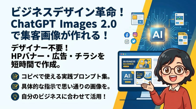
画像生成AIを使えば、HPのバナー、LPのヒーローエリア、WEB広告、チラシ、SNS投稿画像など、ビジネスに使えるデザイン画像を短時間で作成できるようになりました。
特にChatGPT Images 2.0は、文章でイメージを伝えるだけで、雰囲気のあるビジュアルや実用的なデザイン案を作れるため、デザイナーではない方にとっても心強いツールです。
とはいえ、思い通りの画像を作るには、ただ「おしゃれなバナーを作って」と入力するだけでは不十分です。
画像の目的、ターゲット、サイズ、配色、文字の配置、デザインの雰囲気などを、プロンプトの中で具体的に伝えることが大切です。
この記事では、HPバナー・LPヒーローエリア・WEB広告・チラシなど、実際の集客や販売促進に使いやすいChatGPT Images 2.0のプロンプト例を紹介します。
そのままコピーして使える形で掲載していますので、自分の商品・サービス・講座・店舗・ブログに合わせて、文章を少し変更しながら活用してみてください。
このプロンプトの利用上の注意点
このプロンプトはChatGPT Images 2.0専用です。Nano Banana等の他の画像生成AIでは、同じように生成できないのでご了承ください。
また、生成AIは同じプロンプトを使用しても、まったく同じ画像を生成することはできません。レイアウトは同じでも写真やフォントなどに若干の違いが出ることをご了承ください。
このプロンプトで作成したバナーを編集する方法
作成したChatGPTのページで、出来上がった画像に追加で修正を加えていくことができます。
- 色を変える
- 文字を変える
- 女性を男性に変える
- 全体の色の配色を元気なオレンジにしてください
- 全体の色の配色を女性らしい落ち着いたピンクにしてください
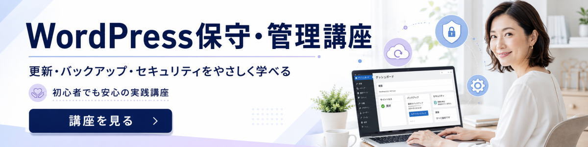
・女性を男性の写真に変えて、全体の色の配色を誠実なビジネスブルーに変更してください。
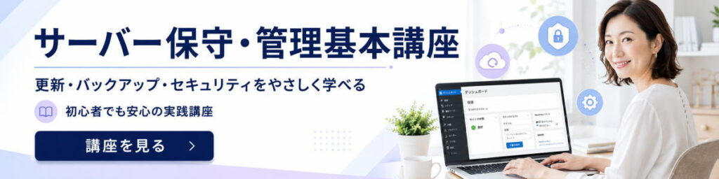
・一番初めに作成した画像の「WordPress保守・管理講座」をサーバー保守・管理基本講座に変更
作成した同じページで、最初に生成した画像に対して上記のように変更を加えていくことができます。ページが変わると、同じ画像を生成することはできませんので注意してください。
ポイントは、複数回変更を加えると一番最後に生成した画像に対して変更を加えるので、1番初めに生成した画像とか、2番目の画像など変更を加える画像を指定しましょう。
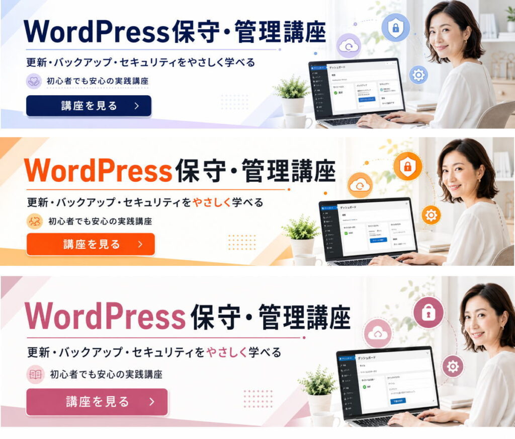
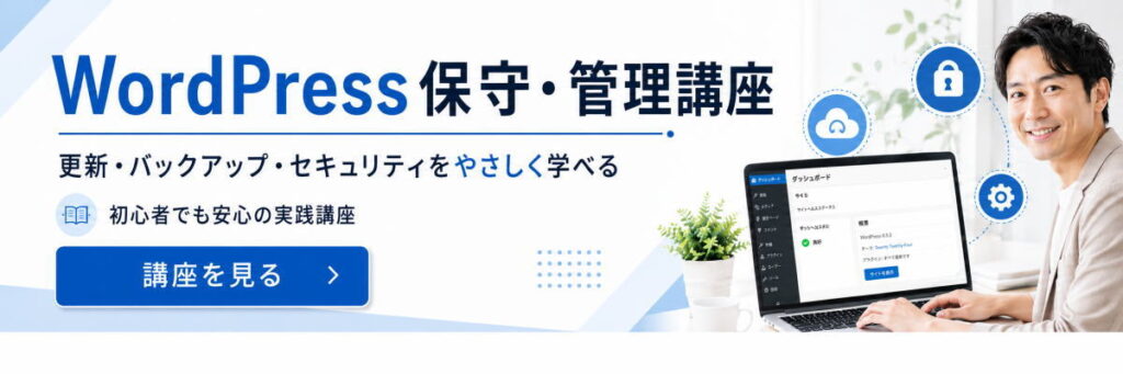
広告用バナー
ビジネスブルー
1200×300の横長バナー向けに、左側に強い訴求文、右側に女性人物+管理画面風ビジュアルを置く構成です。「安心感」「ビジネス感」「初心者向け」を優先してまとめています。
Create a high-quality horizontal web banner for a course promotion, intended to function like a 1200×300 banner. The banner is for a Japanese audience and should target women who are interested in learning practical website maintenance. Make it clean, trustworthy, professional, and visually appealing with a business atmosphere, while still feeling approachable and elegant.

Design goal: attract attention quickly. Prioritize strong visual hierarchy, high contrast, generous negative space, and immediate readability even on small screens.

Layout: left side for text, right side for the main visual. Keep the composition balanced and uncluttered.

Main visual on the right: a friendly, professional Japanese woman in her 30s to 40s, neat and approachable, working on a laptop in a bright modern workspace. Include subtle website-management related visual cues such as a website dashboard on screen, shield/security icon, backup/cloud icon, and maintenance/settings motifs in a polished, integrated way. Do not use any brand logos.

Text must be in Japanese and clearly legible. Render the following text exactly and elegantly:
Main headline: "WordPress保守・管理講座"
Subheadline: "更新・バックアップ・セキュリティをやさしく学べる"
Support text: "初心者でも安心の実践講座"
CTA button text: "講座を見る"

Typography: bold, clean Japanese sans-serif, with the main headline large and prominent. The subheadline should support the main message without clutter. CTA should look clickable.

Color palette: white and light background with navy, soft blue, and a subtle lavender accent to suit a business-oriented but female-friendly design. Premium and polished, not overly cute.

Style: modern online course advertisement, commercial-quality banner, clean grid, crisp edges, refined spacing, practical and conversion-oriented design.
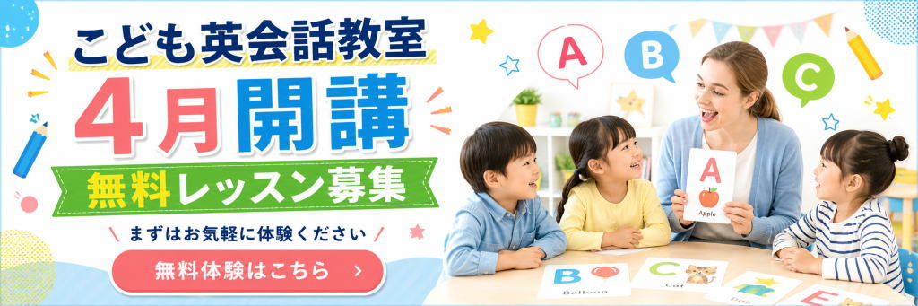
ポップカラー
この1200×300の横長バナーの画像では、
- 「4月開講」を大きく見せること
- 「無料レッスン募集」で訴求を強くすること
- 右側に先生と子どもたちを置いて安心感を出すこと
を優先しています。
Create a high-quality horizontal web banner for a children's English conversation school, with a wide 3:1 layout suitable for a 1200×300 style advertising banner.
The purpose is to promote enrollment and attract attention for a new April opening and free trial lessons.
Target audience is broad, family-friendly, and suitable for parents of young children.
Use a cheerful, colorful, playful, and highly readable design with strong mobile and web readability.
Use a clean white background with bright accent colors such as blue, pink, yellow, and green.
Make the layout visually balanced: bold promotional text on the left, and a warm classroom scene on the right.

Left side design:
Place a large bold Japanese headline at the top:
「こども英会話教室」
Below it, make the main campaign text very large and eye-catching:
「4月開講」
Use extra-large typography, with “4月” in bright pink and “開講” in vivid blue, with soft shadows or outlined lettering for impact.
Below that, place a green ribbon-style banner with large Japanese text:
「無料レッスン募集」
Make “無料” especially eye-catching in yellow.
Under that, add a smaller supporting line in Japanese:
「まずはお気軽に体験ください」
At the bottom left, place a large rounded pink call-to-action button with white text:
「無料体験はこちら」
Add a simple arrow icon inside the button.

Right side visual:
Show a bright, friendly classroom scene with a smiling female English teacher and three happy young children sitting around a table.
The teacher should be holding a flashcard with the letter “A” and a small apple illustration.
The children should look engaged, cheerful, and interested.
Add alphabet learning elements such as speech bubbles with “A”, “B”, and “C”, and colorful learning cards on the table such as B for Balloon, C for Cat, and other kid-friendly English flashcards.
The classroom should feel bright, clean, and welcoming.

Decorative style:
Add playful educational motifs like pencils, stars, dots, pastel shapes, bunting flags, and small doodle accents around the banner.
Make the design pop and feel friendly for children and parents, while remaining clean and professional.
Use strong contrast, generous spacing, and a polished commercial banner style.
The final result should look like a practical Japanese advertisement banner for a children’s English school opening campaign.**
LP用トップ画像
スポーツジム
女性専用パーソナルジム
このプロンプトは、
「女性向け」「信頼感」「LPのファーストビューらしい訴求力」を優先して作っています。
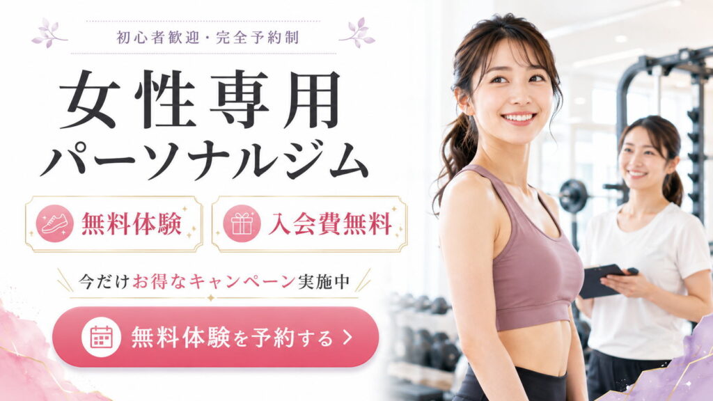
Create a high-quality LP hero section design in a horizontal 16:9 layout for a women-only personal gym campaign in Japan.

The purpose is to sell and attract attention immediately. The target is women. The overall mood should be professional, trustworthy, clean, feminine, and business-like, while still feeling warm and approachable.

Design style:
- clean white background
- soft pink, mauve, light lavender, and subtle gold accents
- elegant and polished Japanese landing page design
- highly readable on mobile and desktop
- strong contrast, generous white space, and a clear visual hierarchy
- practical commercial quality suitable for a real LP first-view section

Layout:
- split composition
- left side: headline, offer badges, campaign message, and CTA button
- right side: a bright, welcoming gym scene with a smiling young Japanese woman as the main subject
- the woman should look healthy, fit, and approachable, wearing stylish workout wear in dusty pink or mauve tones
- behind her, include a female trainer or staff member with a clipboard or tablet
- the gym background should be modern, bright, clean, and slightly blurred, with training equipment visible

Main subject:
- a smiling Japanese woman in her 20s or 30s
- feminine, healthy, confident, and friendly
- athletic but natural body type
- soft natural makeup
- ponytail hairstyle
- bright and polished commercial photography style

Text layout:
At the top, place small elegant Japanese text:
「初心者歓迎・完全予約制」

Main large Japanese headline:
「女性専用」
「パーソナルジム」

Below that, create two elegant promotional boxes side by side:
Box 1 text:
「無料体験」
Include a simple icon related to fitness or sneakers.

Box 2 text:
「入会費無料」
Include a simple gift icon.

Below that, place a campaign line:
「今だけお得なキャンペーン実施中」
Make 「お得なキャンペーン」 stand out in pink.

At the bottom left, place a large rounded pink CTA button with white text:
「無料体験を予約する」
Include a calendar icon and a right arrow.

Visual direction:
- sophisticated Japanese web advertisement style
- feminine and trustworthy
- premium but accessible
- soft pastel decoration in the corners
- subtle floral or leaf motifs are acceptable
- keep the page uncluttered
- focus on one clear message only
- optimize for first-view impact and conversion

Typography direction:
- large, bold Japanese headline
- elegant and readable Japanese font
- short copy only
- clear spacing between headline, badges, and CTA
- easy to scan instantly

Important:
- all Japanese text should be clearly rendered and legible
- maintain a clean LP hero composition with excellent readability
- do not overcrowd the design
- emphasize the free trial and free enrollment fee campaign
一般的なスポーツジム
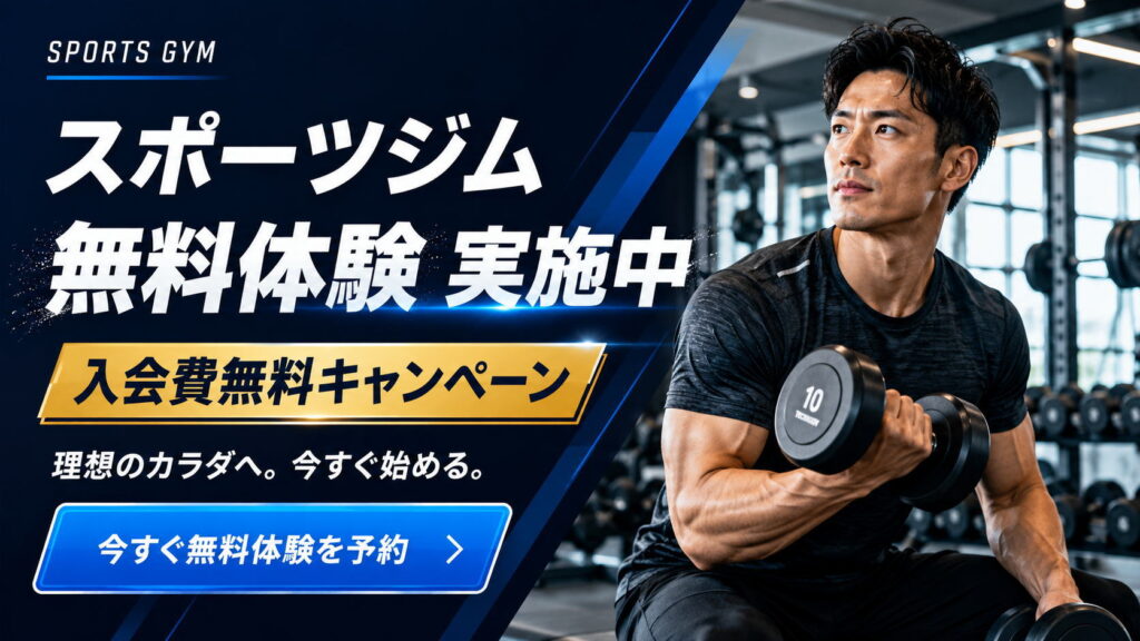
Create a high-quality LP hero image for a sports gym campaign in Japanese, with a horizontal 16:9 layout.
The purpose is to sell and promote gym membership to men, with a strong business-like and trustworthy atmosphere.
Use a clean, polished, high-conversion landing page hero design with strong mobile readability, clear visual hierarchy, high contrast, and enough negative space.

Main concept:
A powerful sports gym campaign promoting a free trial and a no-enrollment-fee campaign.

Layout:
Use a split composition.
Place bold Japanese promotional text on the left side, and a strong, athletic male subject on the right side.
The left side should be a dark navy and blue graphic design area with diagonal dynamic accents, subtle light streaks, and a modern fitness-business feel.
The right side should show a realistic, fit Japanese man in a gym, training with dumbbells, looking determined and aspirational.
Show a premium gym interior in the background with workout machines and weights, slightly blurred to keep focus on the subject.

Typography and text content:
At the top left, place a small English label: “SPORTS GYM”.
Below that, place a large bold Japanese headline: “スポーツジム”
Then place a very large, powerful Japanese headline: “無料体験 実施中”
Below that, add a highly visible gold banner with bold Japanese text: “入会費無料キャンペーン”
Below that, add a smaller supporting Japanese line: “理想のカラダへ。今すぐ始める。”
At the bottom left, add a large blue CTA button with white Japanese text: “今すぐ無料体験を予約”

Design direction:
Use a navy, deep blue, white, and gold color palette.
The mood should be energetic, credible, masculine, professional, and highly persuasive.
Make the text large and easy to read on smartphones.
Emphasize contrast, strong visual impact, and a practical commercial LP quality.
Use sleek fitness advertising aesthetics, modern Japanese web design, and clean polished typography.
The composition should feel like a professional gym campaign hero section for a landing page.
チラシ
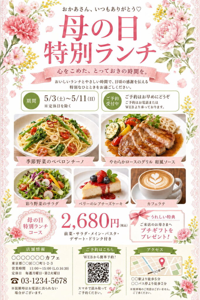
Create a vertical 2:3 Japanese restaurant flyer design for a “Mother’s Day Special Lunch” campaign.
Use a clean white background with soft pink, rose pink, fresh green, and olive green accents.
The overall mood should be elegant, gentle, feminine, warm, and suitable for Mother’s Day.

Decorate the four corners and side edges with watercolor-style flowers: pink carnations, peonies, cherry-blossom-like flowers, small yellow mimosa flowers, green leaves, and scattered petals.
Add delicate pale pink lace borders along the left and right edges.

At the top center, place small Japanese text:
「おかあさん、いつもありがとう♡」

Below it, place a large rose-pink Japanese headline:
「母の日
特別ランチ」
Use an elegant Japanese Mincho-style serif font, soft and refined.

Under the headline, add a pale pink ribbon banner with the text:
「心をこめた、とっておきの時間を。」

Below that, add a centered description:
「おいしいランチとやさしい時間で、日頃の感謝を伝える
特別なひとときをお過ごしください。」

In the upper middle section, create two rounded information boxes side by side.
Left box: green circular label 「期間」, main text:
「5/3(土)〜5/11(日)」
「※定休日を除く」

Right box: green circular label 「ご予約受付中」, main text:
「ご予約はお早めにどうぞ」
「ご予約はお電話またはWEBより承っております。」

In the center, place high-quality food photography arranged in a clean grid.
Top row: two large food photos.
Left: seasonal vegetable peperoncino pasta on a white plate.
Right: grilled pork loin with Japanese-style sauce and vegetables.
Add pale pink ribbon labels under each image:
「季節野菜のペペロンチーノ」
「やわらかロースのグリル 和風ソース」

Second row: three smaller food photos.
Left: colorful vegetable salad.
Center: rare cheesecake with berries.
Right: café latte with latte art.
Add pale pink ribbon labels:
「彩り野菜のサラダ」
「ベリーのレアチーズケーキ」
「カフェラテ」

In the lower center, create the price section.
On the left, place a pink lace-style round badge with:
「母の日
特別ランチ
コース」

In the center, display the price in large rose-pink numbers:
「2,680円(税込)」

Below it, add:
「前菜・サラダ・メイン・パスタ・デザート・ドリンク付き」

On the right, create a special benefit box with a pale pink border, ribbon decoration, and floral illustration.
Text:
「うれしい特典」
「ご来店のお母さまへ
プチギフトを
プレゼント!」

At the bottom, create three information columns.
Left column: shop information with a green ribbon title 「店舗情報」.
Include:
「○○○○○○カフェ」
「東京都○○区○○町1-2-3」
「営業時間 11:00〜15:00(L.O.14:30)」
「定休日 毎週月曜日・第2火曜日」
large phone number:
「03-1234-5678」
small note:
「※混雑時はお電話に出られない場合がございます。」

Center column: reservation QR area with green ribbon title 「ご予約はこちら」.
Text:
「WEBから簡単予約!」
Place a QR-code-style square in the center.
Below it:
「スマホで読み取って
ご予約ください。」

Right column: access information with green ribbon title 「アクセス」.
Add a simple map illustration with a pink location pin.
Text below:
「○○駅より徒歩5分」
「○○バス停より徒歩2分」
Small note:
「※駐車場のご用意はございません。ご了承ください。」

Use a polished Japanese flyer layout, clean grid, generous spacing, high readability, premium café advertising style, watercolor floral decoration, and bright natural food photography.
All Japanese text should be clear and legible.